Friday, December 16, 2011

CHANGE: A Letterpress Triptych

Our final project in GD1 was to create a letterpress triptych. For those of you unfamiliar with wither of these terms, I'll give you a rundown.

Basically, a triptych is three individual pieces meant to be seen at the same time- a series, more or less.  Letterpress is the term for the printing press- the original means of printing newspapers, etc. For this project, we used an iron hand press.

The theme of this project was "change." We had to incorporate letterpress alongside another production method of our choice.

Originally, I had a hard time coming up with a unique concept. However, during one of various web searches, I realized that change is a common factor in many fairytales. Spells, magic, and other trickery often involves a character or thing transforming from one state to another. Thus, my triptych highlights three well-known fairy tales with themes of change- The Frog Prince, The Little Mermaid, and King Midas.

Because I wanted to simulate the feeling of a classic fairytale, I chose to use the Old English typeface, a typeface that invokes images of leather-bound handwritten collections of tales. To further this illusion, I also chose to use a decorative border made wood type.


In addition to letterpress, the second production method I chose to utilize is embossing. Through trial and error, I determined to use white ink on watercolor paper, printing first the blocks of text. This had to be done very carefully, for if the paper shifted at all, it would leave a sticky spot to which the embossing powder would adhere. After a successful printing, I sprinkled colored embossing powder on the design then heated with a heat gun. Once set, I printing the border again sprinkling it with powder and using a heat gun, although this time I used gold for the border.


The gold border across all three pieces adds another element of continuity between the three triptych pieces The metallic hue variations of the text adds some diversity and interest while still adhering to the original concept.


The end result was a series of images that clearly belong in a set but can also stand alone, inviting the user to touch and interact with the pieces.


Wednesday, December 14, 2011

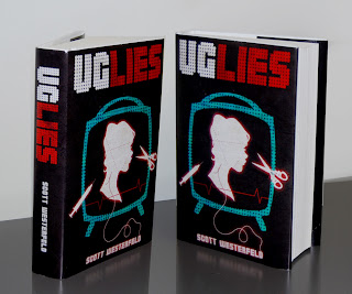
BOOKCOVER REDESIGN: The FINAL

Quicker than I'd have liked, the final presentation came! We were to mount one of the covers onto our book and present all the covers in a pdf presentation.


For the photographic piece, I decided to return to a concept I had early on- photographs of noses. Because noses were the first thing that came to mind when thinking of plastic surgery, I felt this addressed the concept pretty well.

Originally, I took all the nose photos myself, but I had trouble finding consistent light and angle. Thus, I ended up going through a ton of magazines and scanning model's noses, making them symmetrical, and placing them on the cover. While I am relatively satisfied with the result, this concept was definitely my least favorite of the three.


My typographic concept was based on quotes from the book describing the Uglies as weeds and the Pretties as flowers. Thus, I decided to create dimensional text using photographs of dirt, 3d models of roses, thorns, and weeds combined with a photograph of a nasty root. This took a lot more work than I expected, but I was definitely please with the result


My final piece, and the one I chose to mount, was the illustrated piece. I kept with some of the original development illustration, but I decided to add a more sinister and techie feel to it. I was happy with the style and color changes and felt that this piece, amongst all three pieces, most aptly represented the content of the book.


Project DONE.

For more of this project, see:

Tuesday, December 6, 2011

BOOKCOVER REDESIGN: The Development

I began developing my concepts. The easiest for me, by far, was the illustration piece. I love illustration, and I had a clear idea in my head of what I wanted the piece to look like. I referenced some images of Victorian silhouettes, and began the work.


Unfortunately, I was unable to secure my own images for the photographic piece at this point due to losing my camera charger. Thus, I mocked of concepts using found images on the web. However, the image in my head for this piece was not nearly so clear as the illustrative piece, and I wasn't satisfied with the results.


The typographic piece, however, was the most difficult by far. Although I referenced concept ideas for the typographic piece in my previous post, that concept was developed much later. At this stage, I had no clear direction for the typographic piece, despite perusing many graphic design books and websites for inspiration. Thus, at this stage, I have nothing worthy of posting for typographic development.


For more of this project, see...

BOOK REDESIGN- The Concept


The first step in redesigning a book cover was to choose a book. Although previous renditions of the bookcover were very well done, I decided to redesign the cover for the book Uglies by Scott Westerfeld. I had read this book back in high school, and it had influenced me greatly.

The Uglies is young adult fiction set some time in the future when everyone undergoes plastic surgery on their 16th birthday- a surgery that makes their faces and body perfect. Tally Youngblood is excited to undergo this procedure but becomes an unwilling source in helping the authorities locate a community of individuals who are unwilling to undergo the reconstruction. Through this process, she discovers that becoming pretty is not all fun and games.

While there are many themes in this book, they can be narrowed down to the following: self-image, plastic surgery, government, free will, and the definition of beauty.

When sketching out concepts, I stumbled upon a couple that I wanted to pursue. For the photographic piece, I wanted a photograph of a magazine advertising different types of facial combinations. For the illustrative piece, I wanted to lean more towards the classic Victorean image of beauty, with perhaps a few creepy elements here and there. With the typographic piece, I decided to incorporate a concept found in the book: that the pretties were like flowers and the uglies were like weeds.

Unfortunately, do not yet have scanned sketches, so please check back for the update containing them.

For more of this project, see...

BOOKCOVER REDESIGN- The Project

The fourth project for our GD1 class was a bookcover redesign. It was a very open project in that we were able to redesign the cover of any book of our choosing.

We started the project with a Pecha Kucha presentation. This involved a twenty-slide powerpoint of the story we chose, each slide automatically transitioning to the next after 20 seconds. This gave our classmates/teacher the background of the story so they could give more accurate feedback on the appropriateness of our designs. In addition, it refreshed the stories in our own minds, helping us choose a direction for our designs.

While the project itself was open to stylistic interpretations, the techniques we used had a few more rules. We needed to create three separate bookcovers, each addressing a different technique- Photographic, Typographic, and Illustrative.

After finishing these designs, we needed to choose one of the three designs to print and assemble to a copy of our book. The other two designs were to be presented in a powerpoint presentation.

For other stages of the project, please see

Wednesday, November 2, 2011

JOIN ME: The Final


Some times the client doesn't know what he wants and you have to show him. While the CFANS Office of Diversity and Inclusion knew what they wanted to convey, their ideas hadn’t solidified and they couldn’t give us boundaries. This gave us a lot of creative freedom when designing this campaign.

Our final concept includes 4 pieces: a decal series, a poster series, a website, and a “mascot poster.” Ideally, the viewing order of these would be decal, poster, then website. However, all of these elements could be viewed in any order.

1.     Mirror Decal Series
The idea was to engage the audience in an unavoidable way.  We all need to use the bathroom, so what better place to interact with the audience? Our bathroom mirror decal would feature half of a photo of an interviewed individual, a QR code, a website link, and the tagline: What do you reflect? JOIN ME- Reflect Respect and Not Hate. This concept still embodies the basic idea of our original concept, but has a much stronger impact on the viewer.


2.     Poster Series
But the mirror decal doesn’t have a lot of information. What if the viewer doesn’t have a smart phone or laptop with them?

We solved this problem with a poster of the same individual and some of their story, further incorporating the idea that while everyone’s story may be different, we are all people and deserve to be treated with respect.


3.     Website
And if somebody wants to get involved? The can visit the website! Here you would find campaign information, full interviews, and ways for you to share your story.


4.     Mascot Poster
Finally, the mascot poster. Due to a limited budget, Ange asked each team to create a poster that embodies the essence of the entire campaign. Basically, if we could only have a poster and a website to convey the message, what would the poster look like? Instead of focusing on a single individual like the other poster series, the mascot poster would incorporate a large number of pictures in order demonstrate inclusivity.


Project DONE. A special thanks to Jordana for being a great partner to work with!

For more stages of this project, see these links.

JOIN ME: The Revisions


Of course, nothing is perfect the first time around. After submitting our concepts for the Office of Diversity and Inclusion to small group critique, Jordana and I decided to work with the mirror decal project. However, some heavy revisions needed to be made. One major concern was the element of fun/comedy. Discrimination is a serious issue, and Ange believed the client wanted a more serious take on the concept. Thus, we began revising.

We decided to include a more serious individual on the mirror with the tagline “What if you were me?” A poster and a webpage would also be created in order to offer more information to the viewer if he was interested.

After refining the concept, we created a concept page for each element in our campaign. These concept pages, pictured below, were then shown both to the client and to individuals involved in GLBTA who were interested in the project.
                                          (Click on the picture to enlarge.)


JOIN ME: The Concepts


Think outside the box. That was our goal for the CFANS Office and Diversity project, and to reach it, Jordana and I brainstormed… up a storm! Ok, that was bad, I’ll admit.  We did, however, travel around campus looking at locations and observing students/faculty in an attempt to study the way everyone interacted with their environment. In addition, we researched stories of hate crimes and discrimination so we were more informed when creating our designs.

After tossing around ideas, Jordana and I settled on three separate concepts which we would submit to our teach/fellow classmates. (Click on the image to enlarge)

1.     The Swing
This concept really focused on the idea of joining. We would install several sets of swings around campus, both inside and outside, inviting people to swing together with another person. Beneath the swings, we would place decals that named the campaign (Join Me), and listed questions to ask your partner. By doing this, we hoped to encourage people to get to know others better, understand that everyone has a story, and discourage stereotyping/discriminating against others


2.     The Mirror
This concept focused on location and unavoidable interactivity. We would place decals of various features of individuals on the mirror with the tagline: “What if you were me?” We hoped to encourage the viewer to think about life from a different point of view and discouraged discrimination against such individuals.
1.     The String
Our final concept focused on community involvement. We would install several clothesline displays around campus with a writing stand, pen, and paper.  We would as the viewer to answer a question such as “What does diversity mean to you?” They would write their answer on the paper and hang it onto the clothesline.


For more stages of this project, see these links.

JOIN ME: The Project


Join Me.

This was the tagline given to us for our class project. The University of Minnesota CFANS Office of Diversity and Inclusion asked our class to design a campaign promoting awareness and respect in regards to diversity on the St. Paul Campus. Our designs were to include imagery and interviews of St. Paul Campus students and staff while effectively engaging a wide range of people. By the end of the project, we were to have created at least three separate but related pieces, and our teacher, Angela Wang, encouraged us to think outside the box and include some highly interactive pieces.

For this project, we split into teams, and I partnered with the lovely Jordana Reece.

Sunday, October 9, 2011

Alumni Letter Step 5: Final


Finishing at last!  In the last stage, I made quite a few edits.  I changed the color palette yet again to subtly fit a fall/ University of Minnesota theme.  I edited the curved lines to be a hybrid of straight and curvy and added additional illustrations to the back of the envelope.  Finally, I added a background color, gradients, and a noise texture for visual interest.  Below is the final digital file as well as two photos of the assembled and printed products. Although my design was not chosen, I am very pleased with the end result.  It's an interesting addition to my portfolio!

To see the winning design, please visit Bailey Sears' blog → GET IN MY BRAIN


Alumni Letter Step 4: Rework


After feedback received from the online critique, teachers, and peers, I began to rework the piece.  I edited the color palette, replaced/edited some imagery, and added curved lines for movement.

Alumni Letter Step 3: Fleshing Out


The next step in the process was to flesh out the design in a digital format.  I chose a color palette and began illustrating in Adobe Illustrator.  Below is the piece I presented for the online critique.

Alumni Letter Step 2: Concept


The next step was deciding and developing a concept or direction to take the project.  I decided upon "Pave the Way," a catchphrase that relates to the topic but doesn't directly tell the audience what the subject it.  The reader would have to open the letter to get the lowdown.

To accompany this concept, I decided to include college-themed and "after college" icons, illustrating a move from college to the working world. The backside of the envelope would include paving vehicles and the catchphrase.  These illustrations would carry over to the interior of the letter.

The image I've included is of the concept sketch I showed to the client.

Alumni Letter Step 1: Brainstorm


The first project in our GD1 class was an envelope/letter design for the letter sent to the U of M Alumni asking for donations.  Their previous designs had been lacking, to say the least, and it was our job to create a letter that would encourage the audience to open the envelope and read.  They wanted to move away from blatant maroon and gold and include some sort of graphic element- whether it be typography, illustration, or photography.

The first step in this project (as in any project) was brainstorming. Taking a variety of inspirations from various design websites (ffffounditsnicethat, etc), I came up with numerous very rough ideas.  Here are a few sketches of these ideas.